
Why does retention almost always look “healthy”?
Almost every product or marketing team I work with tells me the same thing: retention looks fine. Curves are smooth, numbers are stable, nobody is nervous. I used to trust those charts too — until I started rebuilding retention directly from GA4 exports.
So what are we actually counting most of the time?
In practice, many teams aren’t measuring retention at all:
• They count repeated sessions
• They count background activity
• They count the same users opening the app multiple times
That inflates the metric and creates a false sense of stability. What does GA4 data really allow you to measure?
GA4 is event-based. Retention only exists when you explicitly anchor it to a user and their first meaningful activity.
• Not sessions
• Not events
• Users over time
Anything else is just traffic noise.
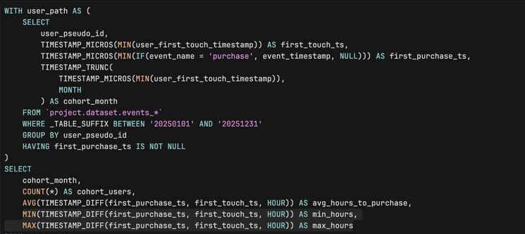
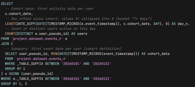
How do I calculate retention now?
I always start with user cohorts based on first activity date and then check whether the same users appear in later periods. It’s less flashy than dashboards — but it finally reflects reality.
Want all my best GA4-BQ queries in one place? I turned them into a Chrome extension — top SQL queries you can search and copy in seconds.
Go here to install it for FREE.
Prefer the web version? It's here.