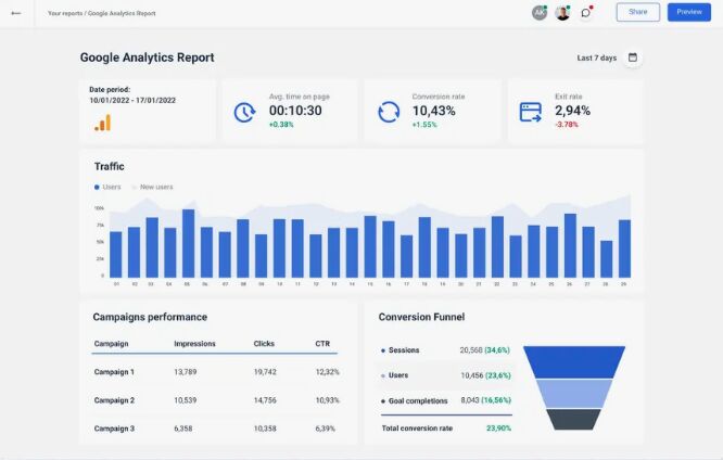
Why does the dashboard impress, but results don’t follow?
I’ve worked with teams where analysts delivered beautiful dashboards. Trends, segments, tidy numbers. Everything reconciled internally.
We followed the recommendations — and the business barely moved. Sometimes it moved backward.
Where does logic break?
A report can be statistically flawless and still be built on the wrong business assumptions:
• wrong attribution window
• wrong definition of “conversion”
• wrong unit of value
• wrong money source
The math is right. The meaning is off.
What usually gets confused
Teams assume errors live in calculations. In reality, they live in questions. If you define the wrong “success”, the dashboard will faithfully optimize the wrong thing.
What I insist on instead
Every key metric must link to real money - deals, payments, margin. Assumptions are documented. Charts come last. I start with a hypothesis and test it against what actually moved in revenue.
Want to get all my top Linkedin content? I regularly upload it to one Notion doc.
Go here to download it for FREE.


