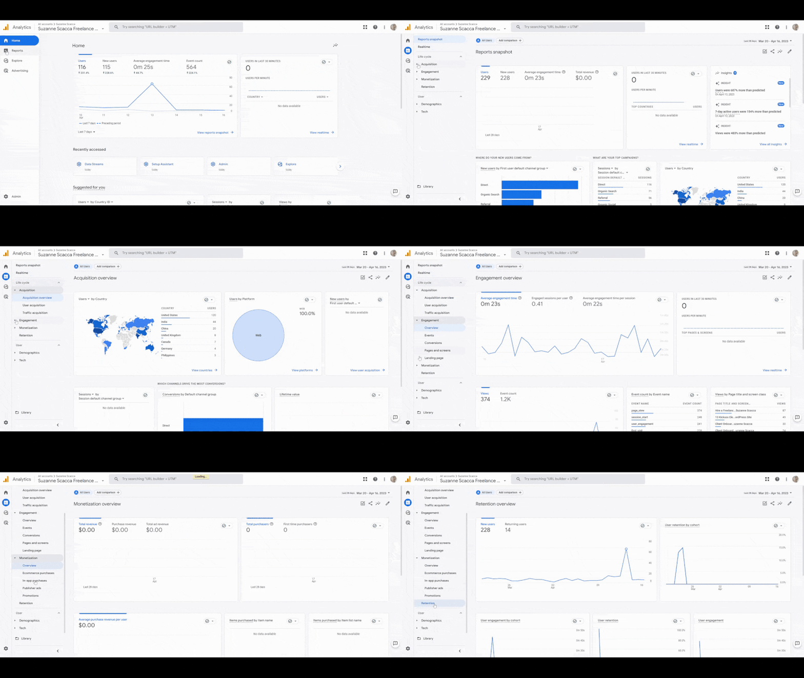
On one project, the client proudly shared a dashboard: “+12% users vs. last month.”
The team was thrilled: the new acquisition strategy was working!
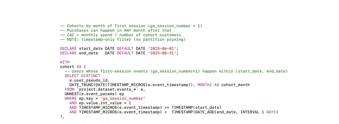
But when we pulled raw data from BigQuery and ran a manual check — the growth vanished.
This month, server-side tagging issues caused part of the traffic to be duplicated. Result: GA4 showed “growth” that didn’t exist.
GA4 isn’t built for reliable period comparisons. Too many hidden variables:
• Data depth varies — some events may still be delayed or missing
• Metric aggregation differs depending on time frame
• Attribution logic can shift day-to-day
• Periods with tracking bugs may look fine in the UI, but behave very differently
GA4 shows a difference — but it might reflect quirks, not real behavior.
Because of this illusion, the client:
• Increased bids on channels that looked like they were growing
• Shifted focus to “new” user segments
• Planned to scale traffic acquisition — despite flat actual numbers
• Shared inflated investor reports based on unstable data
GA4 didn’t lie — it visualized what was available. The error was interpreting it without context.
Now, when I see “+15%” or “–10%” vs. last period, I first:
• Export data from BigQuery to analyze real events
• Check for consistency in tags, sources, and attribution
• Make sure the data has fully loaded
• Compare only validated metrics — not auto-events
• Prioritize absolutes and cohort trends over percentage swings
GA4 is a great interface — but period-over-period deltas can mislead without context. Before acting, always ask: “Are we really comparing apples to apples?”
Want to get all my top Linkedin content? I regularly upload it to one Notion doc.
Go here to download it for FREE.


